


Did you know some chart patterns boast success rates of over 80% when spotted and used correctly? While the market often feels chaotic, decades of historical data reveal that price movements tend to repeat in recognisable ways.
For many investors and traders, these patterns are seen as the market’s “body language,” offering clues about shifts in momentum and sentiment. Every move on a stock chart reflects what investors are thinking and doing, and once you learn to “read” those signals, the idea is that you can spot whether a stock is likely to keep running or flip directions.
The real power isn’t in predicting the future (nobody can do that). It’s about stacking the odds in your favour. Patterns help you zero in on higher-probability setups, fine-tune your entries and exits, and manage risk more effectively, meaning smarter trades and fewer costly mistakes.
In this guide, we’ll break down several reliable patterns and show you which timeframes matter.
The best timeframes for chart pattern analysis
Before diving into specific patterns, you need to understand that timeframe selection dramatically impacts pattern reliability. The same asset can show completely different patterns depending on whether you're looking at 15-minute, daily, or weekly charts.
For instance, take Bitcoin below: the very same moment in time can look completely different on a daily chart versus a monthly chart.
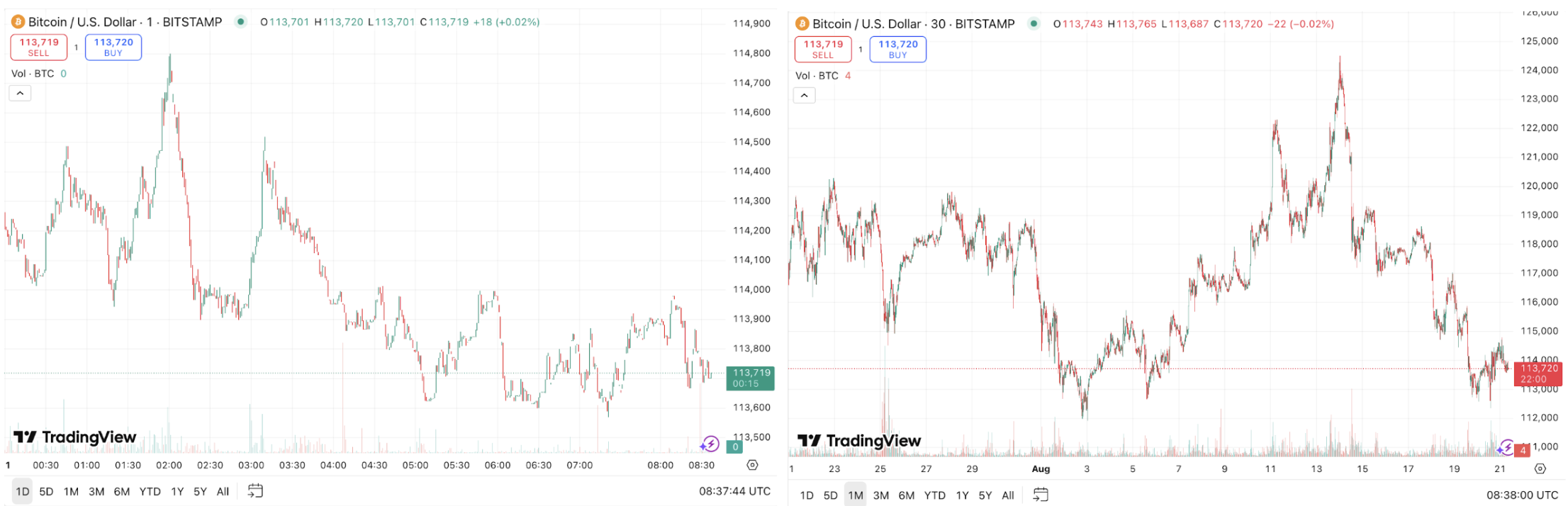
Source: TradingView | 1 day vs 1 month trading charts
Daily charts
For most investors, daily charts often hit the sweet spot because they balance short-term noise with more reliable signals. Patterns that take weeks or months to form on daily charts tend to be more trustworthy because they reflect genuine shifts in market sentiment rather than momentary blips.
4-hour charts
If you’re swing trading (holding positions for days or weeks) 4-hour charts are likely going to be your best friend. They capture medium-term trends and provide more opportunities than daily charts, while still being reliable enough for professional traders to use when sharpening their entries and exits.
15-minute charts
Then there are 15-minute charts, the playground of active traders. They can be exciting, but here’s the catch: shorter timeframes often mean more false signals. You might spot plenty of patterns, but their accuracy drops fast. Only use these if you can stay glued to the screen and stick to strict risk controls.
Many traders chose to blend their timeframes in a layered strategy. Starting with daily charts to lock onto the bigger trend, then zooming into shorter ones to pinpoint their entry.
The 5 most well-known chart patterns for timing
1. Head and Shoulders
The Head and Shoulders formation is one of the most widely studied and discussed reversal patterns in technical analysis. It’s often described as the market’s way of “topping out,” suggesting that an uptrend may be running out of steam.
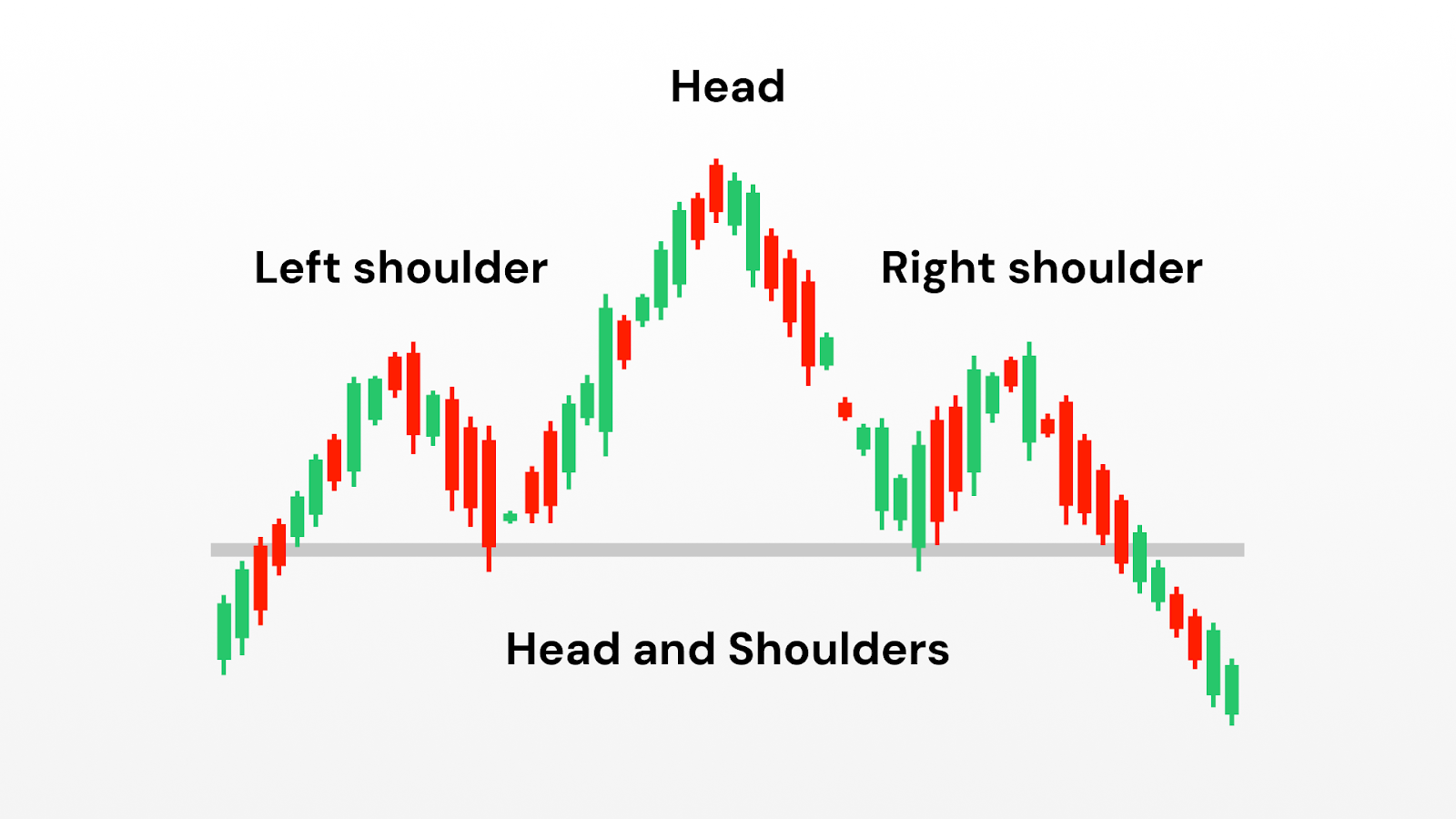
Structure of the pattern
- The left shoulder: An initial rally creates a peak, followed by a decline.
- The head: A stronger rally pushes prices to a higher peak than before, but the move is not sustained.
- The right shoulder: A final attempt to rise falls short of the head’s height, showing reduced momentum.
- The neckline: A line connecting the two low points between the shoulders and the head, often used as a reference for when the pattern is considered “complete.”
When this sequence appears, many analysts view it as a sign that bullish pressure is fading and that selling interest is beginning to dominate.
Why it matters
The head and shoulders pattern is so closely followed because it reflects a psychological shift:
- The first rally shows enthusiasm.
- The higher peak shows overextension but also reveals strong optimism.
- The final, weaker rally shows that buyers no longer have the same conviction. This shift from strength to weakness is why the pattern is often considered a reliable reversal signal.
Variations
Inverse Head and Shoulders: The opposite version, often seen at market bottoms, where the formation suggests a shift from selling pressure to renewed buying interest.
Complex Head and Shoulders: In some markets, extra shoulders may form, reflecting prolonged tug-of-war before momentum reverses.
Caveats
Despite its reputation, the head and shoulders is not foolproof. False signals are common, particularly in thinly traded assets or during periods of high volatility.
Many traders treat it as a useful warning sign rather than a guarantee, and they often combine it with other forms of analysis (such as trend strength, support and resistance zones, or macro factors) to build confidence in their interpretation.
2. Double Bottom/Top
Double Bottoms (bullish) and Double Tops (bearish) are among the simplest and most recognisable reversal patterns in technical analysis.
They occur when the price tests the same level twice and fails to break through, creating what looks like a “W” (double bottom) or an “M” (double top) on the chart.
Analysts often interpret these formations as signals that a prevailing trend may be losing strength.
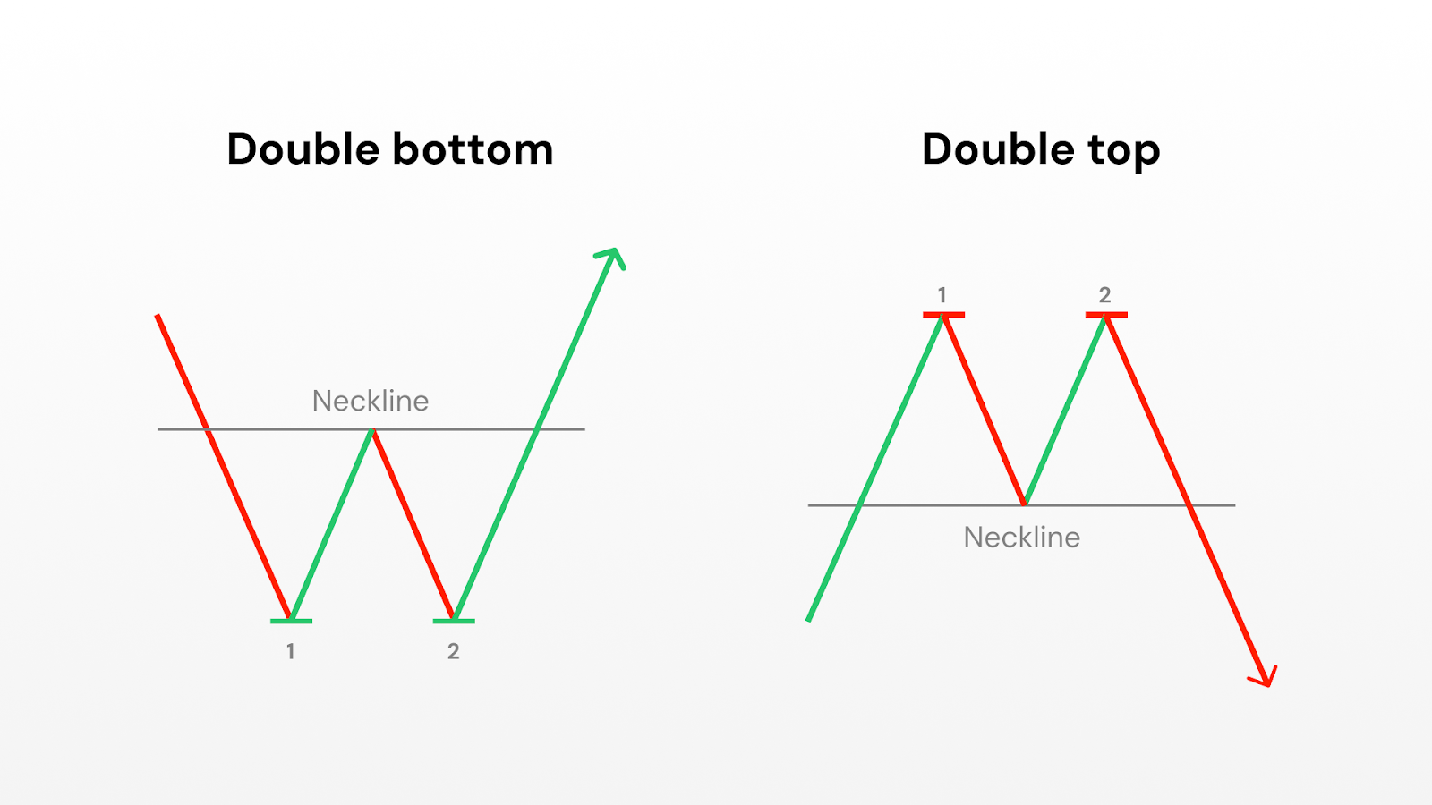
Structure of the pattern
- Double Bottom:
- The first trough forms after a decline, followed by a rebound.
- A second trough appears at or near the same price level as the first, showing that sellers were unable to push prices much lower.
- The interim peak between the two troughs creates a resistance line that observers often watch as a reference point.
- Double Top:
- The first peak forms after an advance, followed by a pullback.
- A second peak occurs at or near the same level as the first but fails to exceed it, showing reduced buying strength.
- The interim valley between the two peaks creates a support line that analysts watch for signs of confirmation.
Why it matters
Double tops and bottoms are considered significant because they capture a classic battle between buyers and sellers. The first test establishes an important price level, while the second test highlights the inability of the market to push through that level a second time. This repetition signals a potential turning point:
- In double bottoms, the failure to break support is often interpreted as a sign of strengthening demand.
- In double tops, the failure to break resistance is seen as evidence of weakening demand.
Variations
Broad or Narrow Spacing: The distance between the two peaks or troughs can vary. Wider spacing often indicates a more meaningful shift in sentiment.
Multiple Tests: Sometimes prices test the same support or resistance level more than twice before a trend change occurs, creating what some analysts call “triple tops” or “triple bottoms.”
Caveats
Like all technical formations, double tops and bottoms are not guarantees. False signals are common, especially in highly volatile markets where short-term noise can mimic the shape of a pattern without any true shift in momentum.
Analysts often combine this pattern with other tools, such as volume trends, broader market direction, or momentum indicators.
3. Ascending and Descending Triangles
Triangles are continuation patterns that appear when prices start moving in a narrower range. This usually signals a pause in the market before the existing trend continues. The two most common types are Ascending Triangles (often seen as bullish) and Descending Triangles (often seen as bearish).
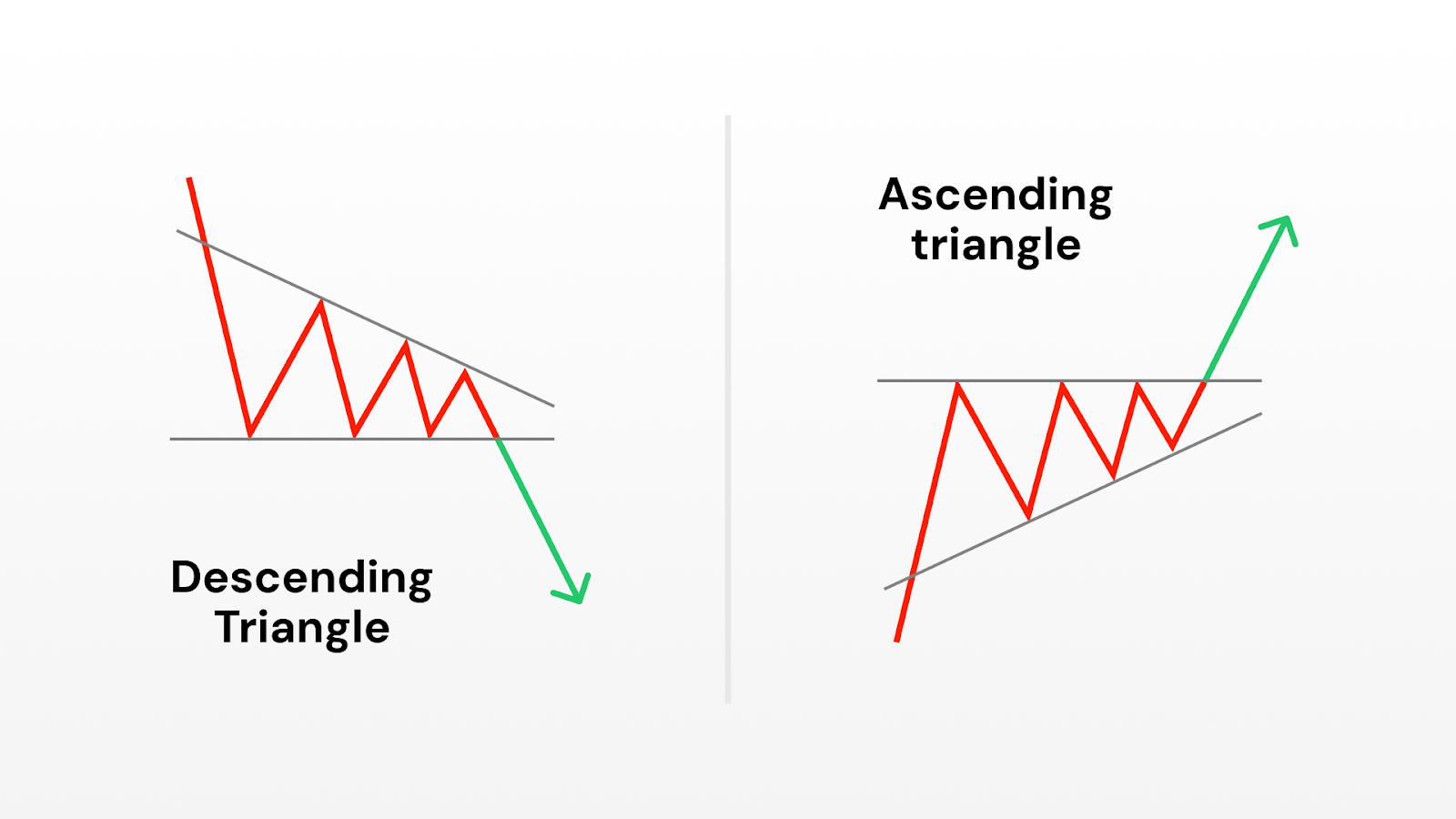
Structure of the pattern
- Ascending Triangle: Price makes a series of higher lows while repeatedly testing the same horizontal resistance. This shows that buyers are becoming more aggressive, steadily bidding prices higher, while sellers defend a key level.
- Descending Triangle: Price makes a series of lower highs while testing a horizontal support. This suggests that sellers are increasingly dominant, though buyers continue to defend a price floor.
- The breakout level: The horizontal line of support (in descending) or resistance (in ascending) is the critical feature analysts watch, as it represents the point where supply or demand may finally give way.
Why it matters
Triangles reflect consolidation: a period where the market pauses, often as traders wait for new information or a decisive shift in sentiment.
- In ascending triangles, the sequence of higher lows highlights persistent demand, hinting at underlying bullish pressure.
- In descending triangles, lower highs point to mounting selling pressure, often seen as bearish.
Variations
Symmetrical Triangles: Unlike ascending or descending, both highs and lows converge toward a point. These are sometimes called “bilateral” patterns, as they can break in either direction.
Time to completion: Many studies suggest that triangle patterns typically resolve before prices reach the tip of the triangle; if not, the pattern may lose significance.
Caveats
While widely followed, triangles are not predictive in isolation. Breakouts can and do fail, particularly in choppy or news-driven markets. Analysts often seek confirmation through trading volume or other trend indicators before treating the pattern as meaningful.
4. Cup and Handle
The Cup and Handle is a long-term bullish pattern named for its resemblance to a teacup. It is frequently studied in equity markets and is often associated with extended uptrends when it completes successfully.
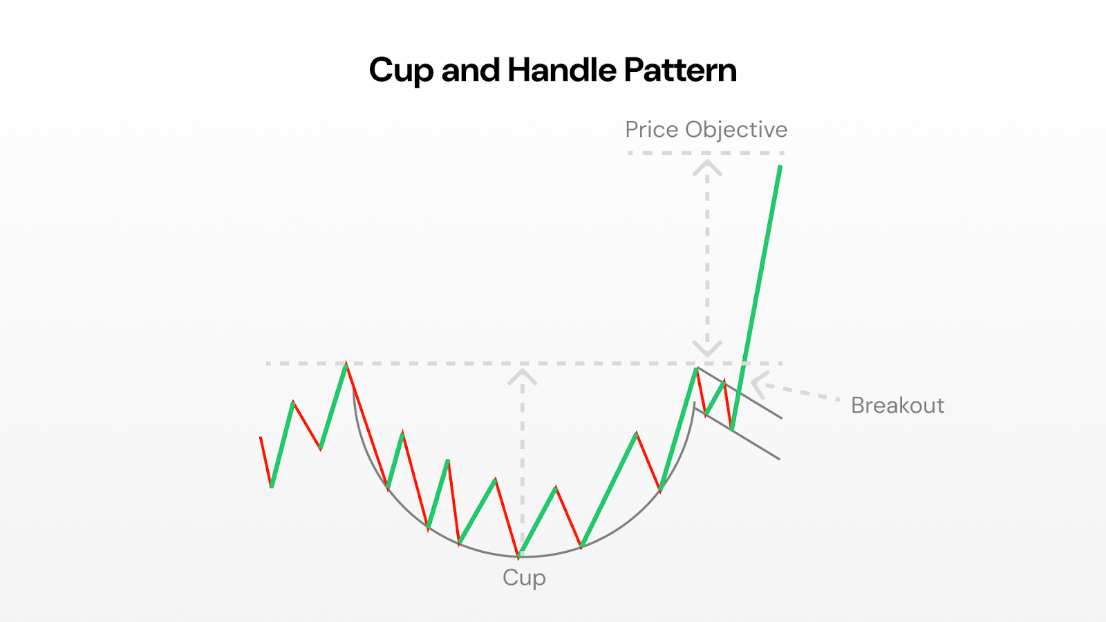
Structure of the pattern
- The Cup: Prices decline gradually, bottom out, and then recover in a rounded, U-shaped curve. The depth of the cup reflects the extent of the pullback before sentiment recovers.
- The Handle: After the cup completes, prices typically consolidate sideways or drift slightly downward in a shorter, shallower formation. This pause is seen as a “shakeout” of weaker hands before a new advance.
- The Breakout Level: The top of the cup, where prices previously peaked before declining, becomes a reference level for confirmation.
Why it matters
The Cup and Handle is often interpreted as evidence of a market shaking off selling pressure and regaining strength. The extended base (the cup) suggests long-term accumulation, while the smaller handle shows short-term hesitation before renewed buying. This blend of consolidation and recovery is why the pattern is often associated with continuation of an uptrend.
Variations
Deep vs. shallow cups: Shallow cups are generally considered stronger, as they indicate lighter selling pressure. Very deep cups can signal weaker underlying demand.
No handle: Occasionally, prices break out directly after forming the cup without creating a handle. Some analysts treat these as valid, while others consider the handle an essential feature.
Caveats
Because cup and handle formations often take weeks or months to develop, they can be subjective. False signals are common if the “handle” drifts too low or if volume patterns don’t align with expectations. As with other patterns, context (i.e. broader market trends and sector strength) is critical.
5. Flag Patterns
Flag patterns are short-term continuation formations that occur after sharp price movements, known as “flagpoles.” They are named for their resemblance to a flag on a pole: a rapid advance or decline, followed by a small rectangular consolidation sloping against the trend.
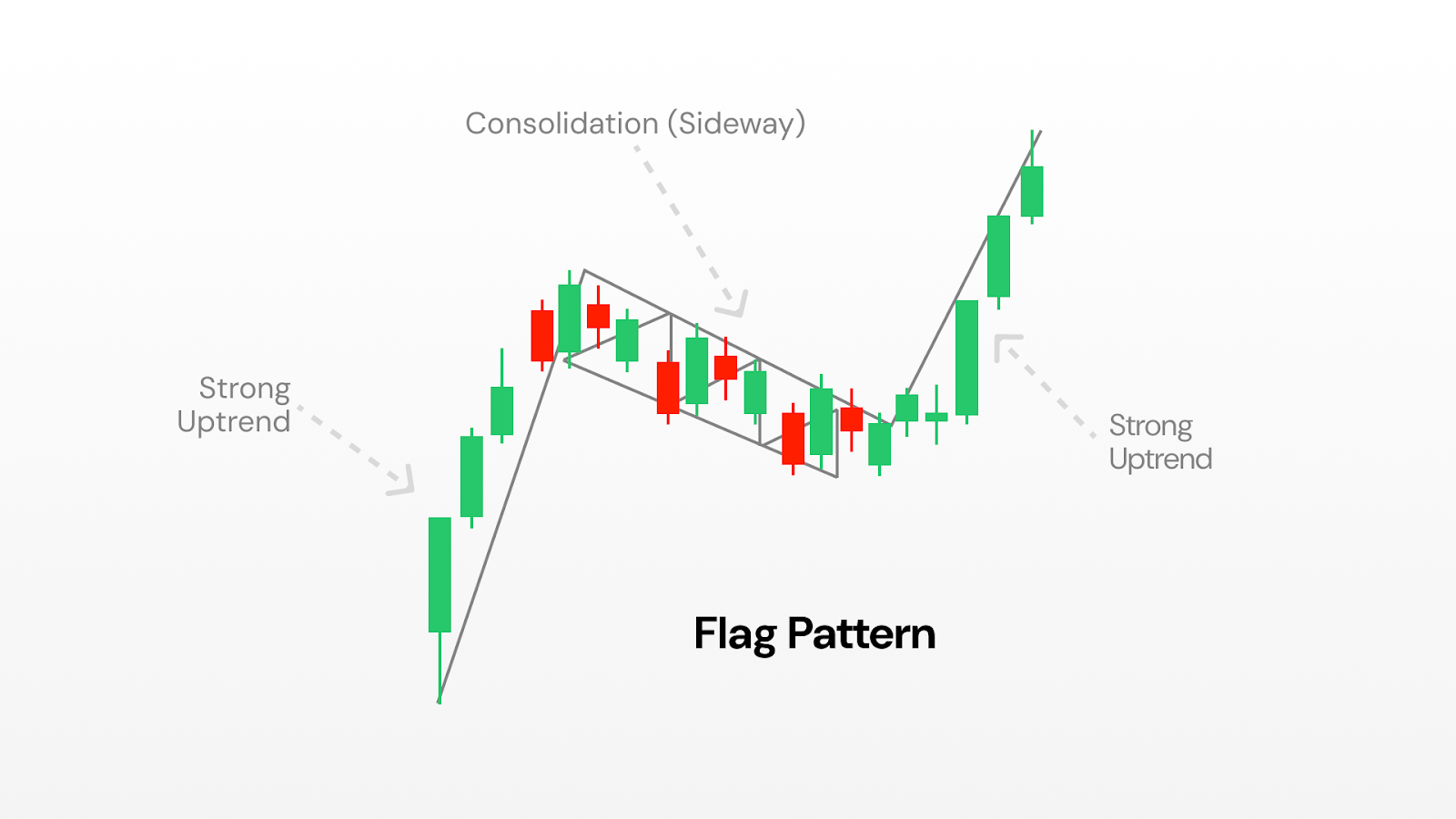
Structure of the pattern
- The Flagpole: A sudden, strong move in one direction, often accompanied by high trading volume.
- The Flag: A brief consolidation where prices move sideways or slightly against the prevailing trend, usually within parallel lines that slope modestly.
- Resolution: If the pattern holds, the prevailing trend resumes after the consolidation.
Why it matters
Flags capture the rhythm of momentum markets. The flagpole reflects urgency, often from institutional buying or selling, while the flag represents a pause where the market digests the move. This pause is considered healthy in a trend, as it can prevent overextension.
Variations
Bullish vs. Bearish Flags: Bullish flags slope downward after an upward flagpole, while bearish flags slope upward after a downward pole.
Pennants: A related pattern where consolidation takes the form of a small symmetrical triangle rather than a rectangle.
Caveats
Flags are short-term patterns, often lasting only a few sessions to a few weeks. Because they form quickly, they are prone to producing false signals, especially in volatile markets. Analysts stress the importance of volume dynamics and overall market context before giving weight to a flag formation.
Pattern categories: continuations vs reversals
Not all patterns tell the same story. Some hint that the market is just taking a breather before carrying on, while others warn that momentum is running out and a reversal could be around the corner.
Continuation patterns - think triangles, flags, and pennants - pop up roughly 70% of the time when a market is trending. They usually mean the pause is temporary and the trend is about to resume.
Reversal patterns - like head and shoulders or double tops and bottoms - are less common but pack more punch. When they appear, they often mark a major turning point.
Then there are bilateral patterns such as symmetrical triangles. These are trickier because they can break either way. They tend to shine in volatile, uncertain markets where direction isn’t obvious.
The secret is context. Continuation patterns work best when the trend is already strong, while reversal patterns are most powerful after a long, extended move. Match the pattern to the bigger picture, and you’ll read the market with far more accuracy.
How traders often approach chart patterns
Spotting a pattern is just the start. To trade them successfully, you need a clear set of rules for when to act, how much to risk, and when to walk away. These rules will be specific to your personal needs, and should be discussed with a financial advisor if you’re unsure.
Confirm your entry. Analysts generally stress the importance of waiting for confirmation (like a breakout or changes in volume) before treating a pattern as complete. Set alerts at key levels so you don’t waste hours glued to charts.
Protect yourself with stop-losses. Most traders place their stop just beyond the pattern’s critical level. For breakouts, that means just below the breakout point; for reversals, just beyond the highest high or lowest low.
Set realistic profit targets. The measured move gives you a solid first target. Many traders take partial profits there (say half the position) and let the rest ride with a trailing stop, locking in gains while leaving room for more upside.
Size your positions wisely. Risk management is often discussed in terms of position sizing. For example, some traders limit risk on a single trade to just a small percentage (e.g. 2-3%) of their account, so that several losses don’t cause major damage.
Respect the clock. Patterns don’t work forever. If the move hasn’t unfolded within the expected window (usually 2-3 weeks on daily charts), it’s often best to exit, even if your stop hasn’t been triggered.
Do chart patterns really work?
Chart patterns aren’t crystal balls, but they can give you a genuine statistical edge when used properly. Studies show that well-formed patterns on highly liquid stocks deliver success rates between 60-85%, far better than pure chance.
That said, no pattern is bulletproof. Around a quarter to nearly half of them will fail. This is why risk management and position sizing aren’t optional; they’re your safety net. You need to be able to take several hits without blowing up your account.
Patterns also don’t exist in a vacuum. They’re much more reliable when they line up with the bigger picture - things like the overall market trend, sector strength, or even key fundamentals. A bullish setup in a weak sector or during a bear market has the odds stacked against it.
And remember: context is everything. Chart patterns work best in “normal” market conditions. In periods of extreme volatility, major news events, or panic-driven trading, emotions often override technical signals.
Level up: advanced pattern techniques
Once you’re comfortable spotting the basics, a few advanced techniques can take your timing to the next level.
Watch the volume. Real breakouts usually come with a surge, at least 50% above recent average volume. Volume should also “fit the story”: tapering off during consolidation, then expanding sharply when the breakout hits.
Use multi-timeframe confluence. When the same pattern shows up on both daily and weekly charts, or when shorter-term setups align with longer-term trends, your odds of success might climb.
Validate with support and resistance. The strongest patterns often form at levels the market has respected before. Multiple past tests of support or resistance add weight to the signal and help filter out false moves.
And always remember: chart patterns aren’t fortune tellers. They’re tools to tilt the odds in your favour, not guarantees of profit. Combine them with sound risk management, diversification, and realistic expectations. With practice and discipline, pattern recognition can become a powerful part of your trading toolkit.
This article is for general information purposes only and is not intended to constitute legal, financial or other professional advice or a recommendation of any kind whatsoever and should not be relied upon or treated as a substitute for specific advice relevant to particular circumstances. We make no warranties, representations or undertakings about any of the content of this article (including, without limitation, as to the quality, accuracy, completeness or fitness for any particular purpose of such content), or any content of any other material referred to or accessed by hyperlinks through this article. We make no representations, warranties or guarantees, whether express or implied, that the content on our site is accurate, complete or up-to-date.
